You may want to consider staging your home, even in a seller’s market. Here’s why.
Top 4 Tips For Creating a Vignette
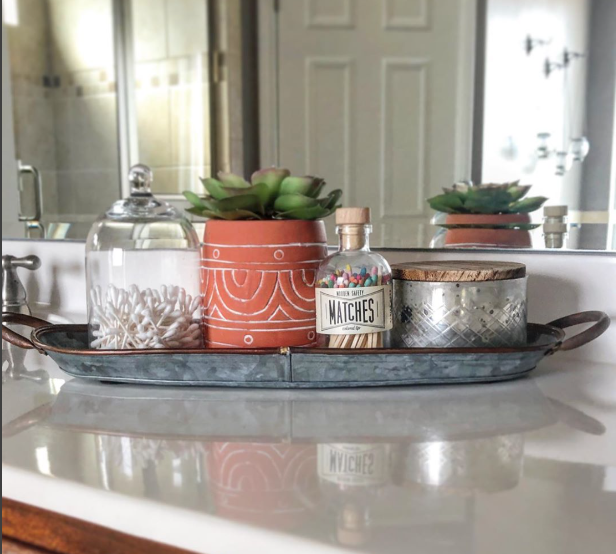
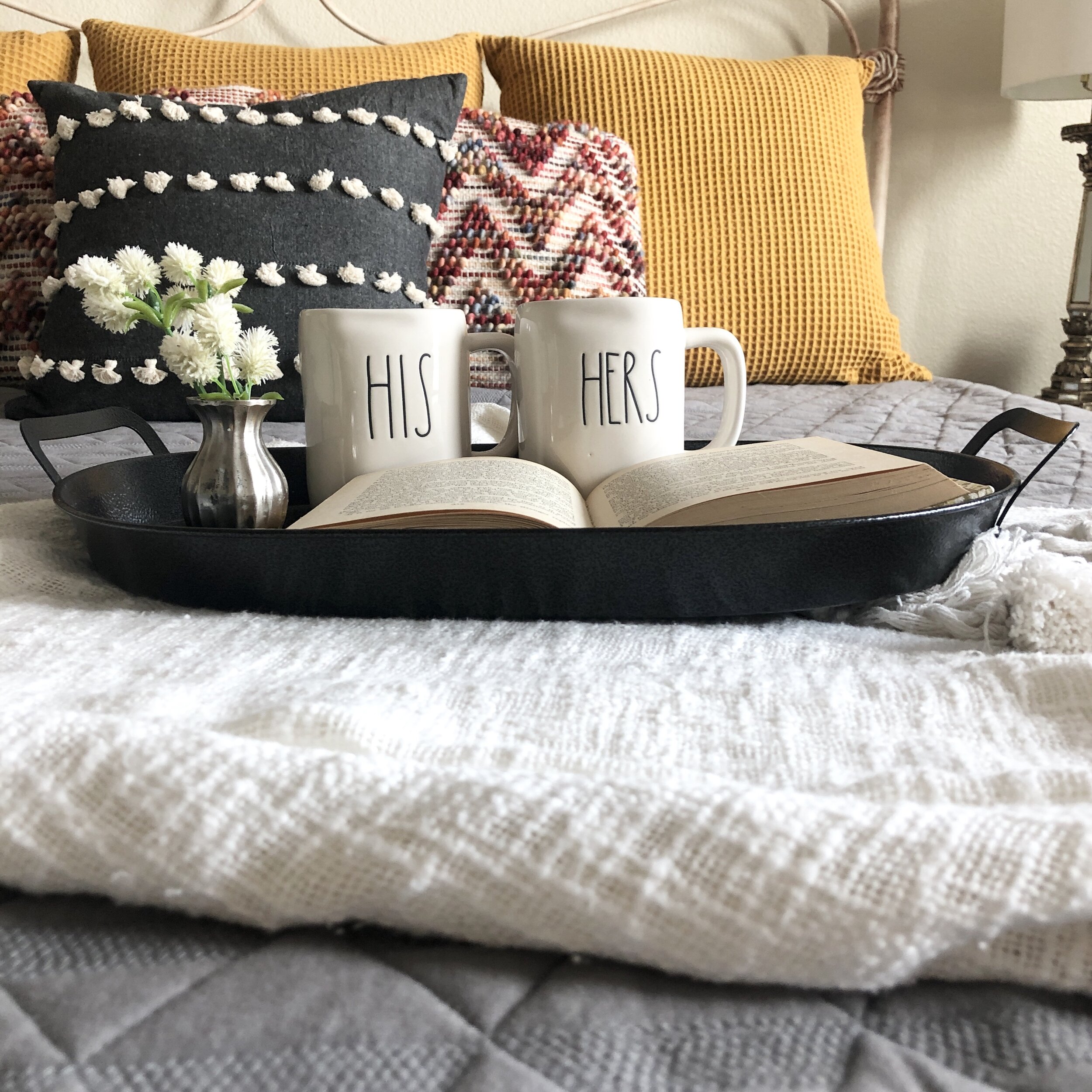
One of our go-to tricks in staging is creating beautiful vignettes, or groupings of items on a flat surface. Vignettes instantly add a designer-worthy style to your home and enhance functionality of your space. All you need are a few loose items, a tray or flat surface, and these 4 tips to get started:
Use functional items to the space
In the kitchen, display various kitchen items like bowls, tea cups, or a cute pitcher together on the counter or on a cutting board. On the laundry room counter, add a jar of clothespins with a candle and plant. By adding a functional item, you are suggesting enjoyable and practical use of your space.
2. Vary height of items
Be sure to follow the high-medium-low principal when grouping items together. Use books to elevate smaller items.
3. Add an organic touch
Add a touch of greenery to give an airy and organic feel to the space. If you don’t have a free standing plant, add stems to a coffee cup, jar, or a functional item to the space.
3. Layer items to create dimension
To create depth, place your objects from the back of the flat surface to the front rather than lined up in a straight line. This will add dimension to your vignette.
4. Use odd numbers
Group items together in odd numbers. Groups of three or five have a stronger visual impact than a group of two or four.
Happy Staging!
Danielle, Lynley, and Rainie
3 Key Differences Between Staging and Design
Here at LD Design Co. our tagline is: Staged to Sell, Designed to Dwell, and our team is happy to offer services that cover both ends of the spectrum: staging and design. So how are they different? While creativity and an eye for design are essential for both, there are 3 key differences.
1. To personalize or not, that is the question
In staging we are always trying to de-personalize the space so that it appeals to the largest pool of potential buyers. That means, removing sports memorabilia, religious symbols, collections, degrees and certificates and family photos.
In design we want your homes to be personalized to you and your family’s story. Hang your degrees proudly, showcase that rare porcelain cat collection, add your favorite scripture verse, and let your son decorate his room in his favorite sports teams colors.
2. Conservative vs Liberal (please, no political jokes)
In staging we keep things conservative, on trend and neutral. We try to keep all buyers interested, open minded and not overly emotional one way or the other.
In design you can go bold, use crazy colors, have unique creative furnishings and add complex heavy patterns. You might be the only person who loves neon paint, but it’s your home and you’re the only person that needs to love it.
3. Rule Follower or Breaker
In staging we follow rules, lots and lots and lots of rules.
In design there’s great news for you - there are no rules! If you want a rug on a carpet, put a rug on a carpet. If you want painted ceilings, paint your ceilings. If you block off a walkway so your toddler can’t escape, great! If you want your formal dining room to be a kids play-room, snap your fingers and make it a playroom.
Remember- The way you live in your home and the way you stage your home are two different things!
The 4 Cs of Staging: Communication
We have been unpacking the 4 Cs of Staging over the past month. If you are new here, thanks for joining us, and be sure to check out what you’ve missed here! If you’ve been following along, then you know we are down to the last C….
COMMUNICATION
Congrats! You now have all of the important tools and tricks to stage and now just have to put it together effectively to present your property in the best way. Remember, you have the power to determine what your house will communicate to potential buyers. Before the finishing touches, here are 3 important questions to ask when determining what you want to communicate through staging.
1. What do I want my house to say?
You control the narrative of your home. Be sure to complete simple repairs in order to communicate your house is well taken care of. A broken front door knob verses a fixed one can make a difference in communicating your house is attended to. Neutral paint and freshly patched walls communicates your house is worth more versus dropping the price to cover outdated paint and cosmetic repairs.
2. What do I want this room to say?
Communicate functional use of each space by adding pops of functionality through trays or decorative items. For example, if you want your dining room to feel like an entertainment space, be sure to set the table with beautiful place settings. If you want to show off your laundry room, add a tray with a jar of powdered detergent, a candle, and clothes pins. Check out more staging ideas and examples here.
3. What do I want my design atheistic to say?
By choosing the right paint colors, textiles, fixtures, and accessories your home can communicate a number of things from a relaxing retreat to a updated family home. You don’t have to break the bank to make this happen. Keep anchor pieces and swap out smaller accessories like throw pillows, rugs, and cabinet hardware to accomplish the vibe you want your home to communicate.
Happy Staging,
Danielle, Lynley, and Rainie
The 4 Cs of Staging: Creativity
We continue on our journey through The 4 Cs of Staging this week by unpacking the most fun of all the Cs— creativity! If you have missed the first part of our series, check out the foundational steps of the Cs here.
CREATIVITY
Now that you are successfully clutter-free and clear, it is time to add some purposeful decor back in with creativity. Staging is not just about decorating, but it is a very important aspect of staging effectively. Through decorating, your home comes to life and has personality, but it can be hard to know where to start, so remember the basics:
1. Utilize High/Medium/Low
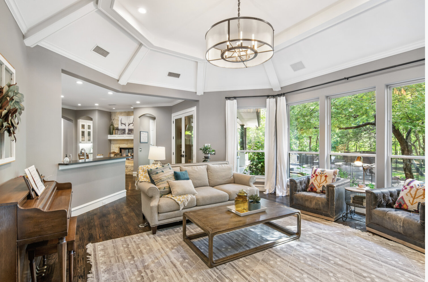
When entering a room, the buyer’s eye should bounce between high, medium, and low levels. This allows the room to feel larger and gives the space movement. Ideally, art can be high (not too high, all art should hang relatively at eye level), furniture can be medium, and rugs or floor plant can be low.
2. Create a Neutral Palate with Pops of Color
Start with a neutral paint color for walls (beiges, cozy whites, subtle grays) and add a consistent pop of color in your textiles, art, and accessories. Pops of color should be calming colors and not too bright or loud.
3. Bring the Outside Indoors
Every home should have an airy, organic feel, which can be accomplished by adding greenery. Either utilize real plants or choose faux greenery that looks real in order to liven up your space. Some of our best go to faux stems include eucalyptus, lamb’s ear, and boxwood.
4. Vary Textures
Add texture in your furnishings and accents. Many times, we think about adding interest with color, but varying texture in throw pillows, rugs, and even furniture will also add depth and interest to your space.


