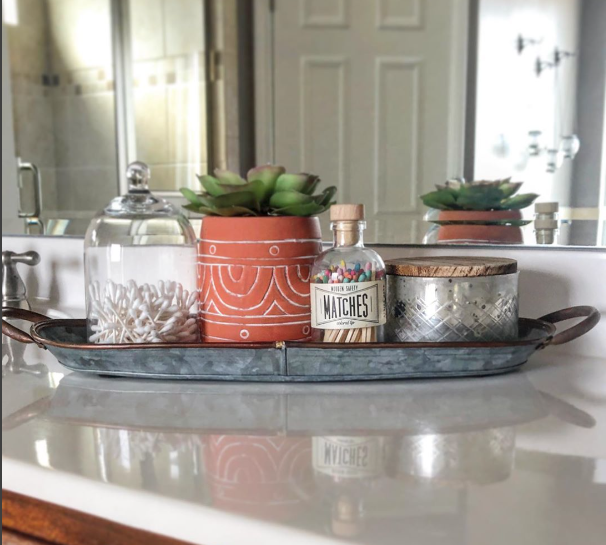
Our Favorite White Paint Colors

We asked our team of 7 designers and stagers, what is your favorite white paint? Here are the results!

Featured: Behr Divine Pleasure (color matched at Sherwin Williams)

Featured: Sherwin Williams Alabaster

Cool White Paint Colors

  • SW Natural White

  • SW Extra White

  • SW Ice Cube

Soft or Warm White Paint Colors

  • SW Alabaster

  • SW Greek Villa

  • SW Shoji White

  • SW Snowbound

  • BM Cloud White

  • BM Swiss Coffee

  • BM White Dove

  • Behr Divine Pleasure (color matched at Sherwin Williams)

White paint colors can pull different undertones and look different in every room! If you are struggling with what paint color to use in your home follow our 3 suggestions here or call us for a Color Consultation!

3 Ways to Add Interest for a Neutral Palette

Do you love a neutral color palette but struggle with keeping the space interesting? Use these three tips to keep your eye moving around the room and create dimension in your space.

  • Shades - Use a Variety of Shades. Neutral colors, in general, cover a wide palette, including ivory, grey, beige, white, taupe and brown and black. Mix it up!

  • Textures - Layer different textures to create contrast. Let this be your guide instead of color. Incorporate a variety of materials such as wood, metal, and upholstery to add interest.

  • Shapes - Neutral color can bring shape into the foreground of your design. Incorporate a mixture of shapes to capture attention or add dimension to a room.

Choosing the Best White Paint Color

Choosing a white paint can be tricky! More than 600 shades exist among the major paint companies, and they all differ in some way. One thing they all have in common- the ability to instantly refresh a room. Use these three tips to help you choose the best white for your space.

1. Natural Lighting

North-facing rooms tend to have cooler, less bright light so they need a warmer white, while Southern facing rooms get intense golden light, so a cooler white is ideal.

2. Undertones

Cooler whites have blue, green or purple undertones, so they appear crisp and icy. Warmer whites have hints of yellow, orange and red give these shades a cozy feel.

3. Test it!

Use peel and stick paint swatches to see it in your space. Observe how the color looks in both natural and artificial light as well as during the day and at night. You can get some of them from your local Sherwin Williams or you can order on www.samplize.com

How to Stage a Primary Bedroom

When we stage homes, one of the most important rooms to stage is the primary bedroom. These three tips will help your primary bedroom look it’s best!

  • Declutter

    Remove personal items from bedside tables, hide laundry baskets, and store any excess furniture. Pre-pack personal items such as photos and memorabilia.

  • Arrangement

    Place bed on the largest wall to make the room appear as large as possible. Matching nightstands should flank either side of bed for balance. If you have the space, add a bench at the foot of the bed.

  • Bedding

    Bedding should be relaxing and inviting. A well made bed is a must. Utilize neutral bedding to keep it light and neutral. Throw a cozy blanket or duvet at the foot of the bed for an extra layer.

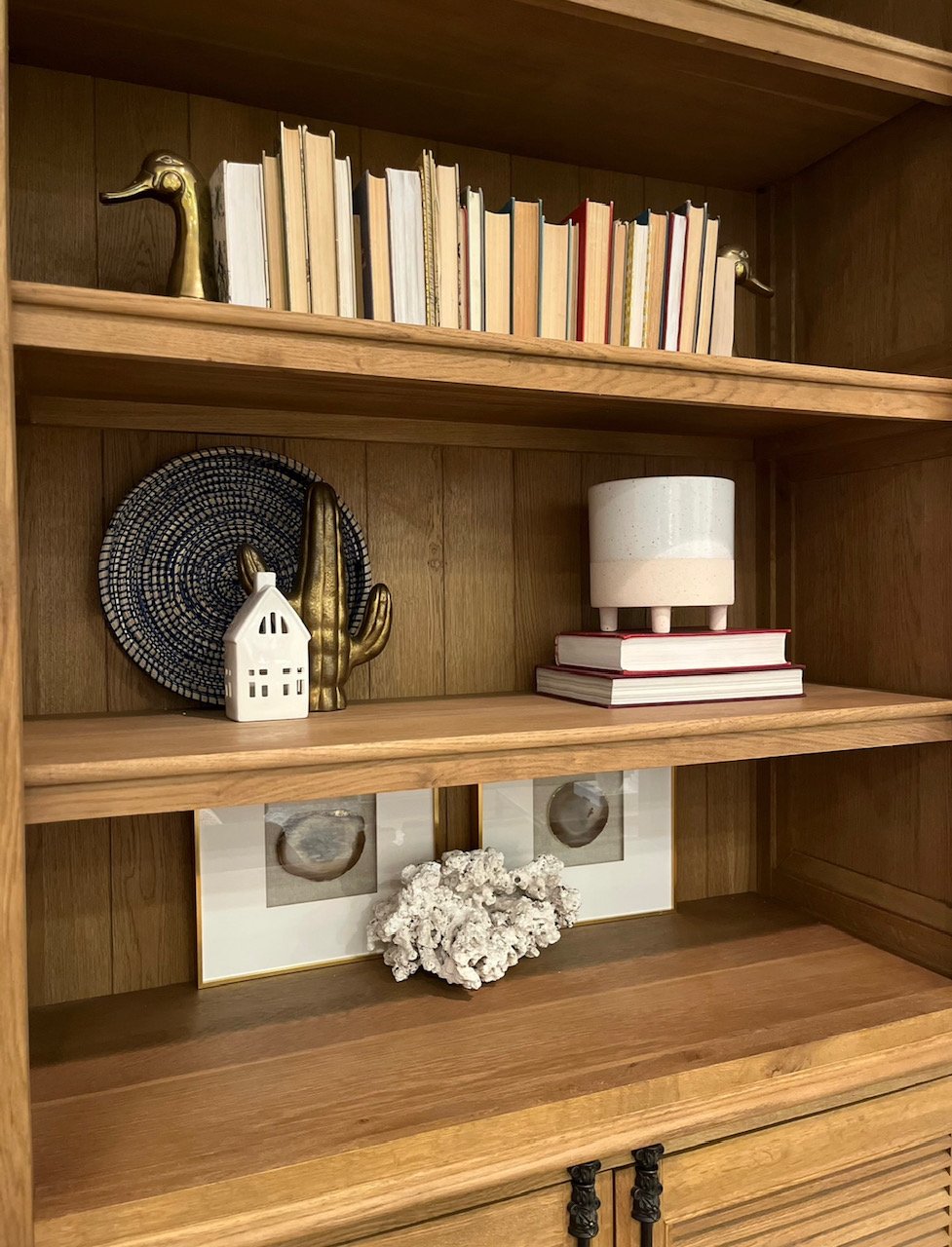
Shelf Styling 101

One of our favorite parts of staging is styling shelves. This can be an overwhelming task for those who aren’t comfortable styling so here are some quick tips to help you style those shelves with ease.

1. Group similar items (candlesticks, pots, books).

2. Odd numbers are your friends, so utilize sets in odd numbers.

3. Vary height by layering shorter and taller items in front of one another, overlapping.

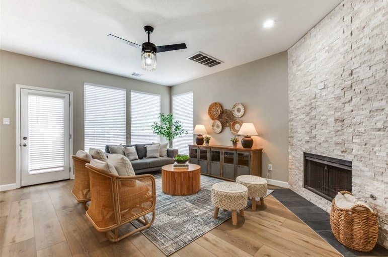
Three Tips for Decorating a Living Room

Decorating a living room comes can come with challenges when dealing with an off centered fireplace or odd shaped room. We have found that these three tips can help determine the overall layout and function of your space.

  1. Focal Point - Every room should have a focal point. Sometimes rooms have natural focal points, but if the room doesn't, you will want to choose one. It might be a fireplace or you can even create one with an eye-catching piece of artwork.

2. Furniture - Try arranging furniture in a way that is conducive to having a
conversation (rather than watching tv), which will give your space a
warm, balanced feel.

3. Texture - Too much of the same texture (wooden, upholstered, etc.) can feel one
dimensional. Use a variety of textures in your furniture to keep it interesting. Area
rugs go a long way to cozy up your space!

Still struggling with how to decorate or arrange your living room? Contact us at info@lddesignco.com for an Interior Design Consultation.

Highest Impact Rooms to Stage

According to NAR’s 2023 Profile of Home Staging 81% of buyers' agents said staging a home made it easier for a buyer to visualize the property as their future home. The process of staging can be overwhelming for buyers and that’s why we recommend focusing on staging these 3 areas of the home with the biggest impact.

Living Room - Potential homebuyers are looking for cozy living spaces where they can relax and entertain friends or relatives. This is the space that you want to feel warm, cozy and comfortable. Bringing in warm, neutral colors and showing how the space can be utilized allows a potential buyer to picture themselves in the space.

Kitchen - The kitchen is the heart of the home. Showcasing a kitchen’s best features can be done with the right staging eye. Staging with plants and natural elements in the kitchen helps the space feel organic while making sure to keeping the pieces minimal to highlight the amount of counter space.

Primary Bedroom - When staging the Primary Bedroom the goal is to create a relaxing space that shows buyers they'll be able to cozy up and unwind. We always keep in mind the scale of the room when bringing in furniture so you can highlight how spacious the room can feel.

Interested in booking a staging consultation? Email Danielle at danielle@lddesignco.com

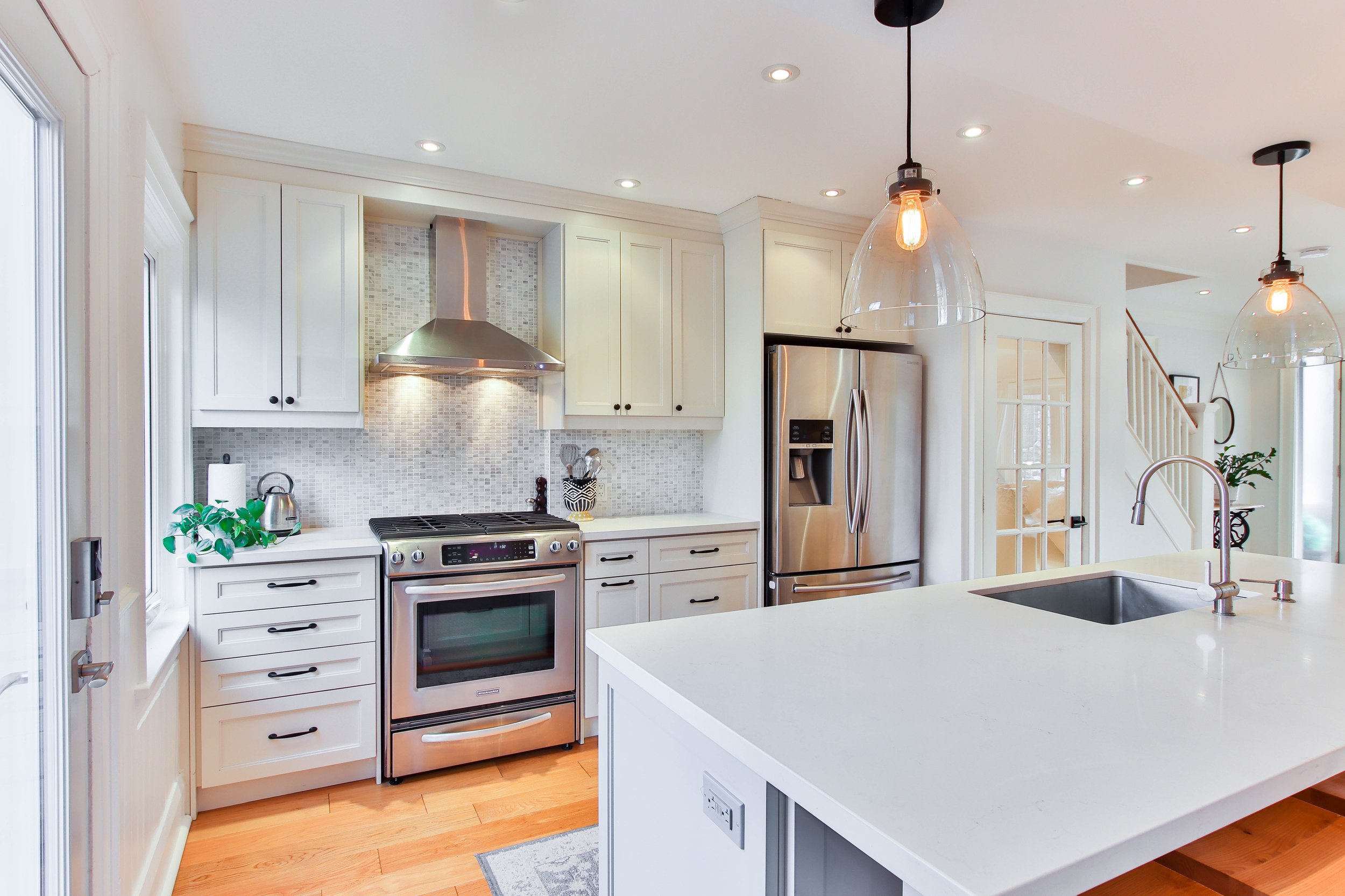
3 Tips for Decluttering Your Kitchen

The kitchen is one of the most important rooms in the house for potential buyers and owners. To best showcase you or your clients kitchen, consider decluttering it using these three steps.

  1. Counters

    Crowded kitchens communicate lack of storage space to potential buyers. Clear off counters by removing all items and only adding back in a few thoughtful pieces. Keeping a plant, canisters, coffee machine or utensil jar can be a good start to keep it minimal and aesthetically pleasing.

2. Refrigerator

This can quickly become a collection of our lives. Remove the magnet collection and kids’ school pics off the fridge as well as all storage items on top of the fridge.

3. Seating

A roomy dining space is more important than maximum seating. Try removing the 2 end chairs from your table or try 3 seats at the counter instead of 4. You will be amazed at how much larger it allows your space to feel.

The 3 C's of Staging

When staging a home, there are a few key aspects to consider for your home to look best and help future buyer’s envision themselves in the space.

  1. CLEAN

    Outside, power wash your deck and windows. Inside, deep clean all surfaces. Wipe down baseboards, fans, and vents. Don't forget those hard to reach areas. When surfaces or the home appears dirty, buyer’s begin to think about what other parts of the home the homeowners have left unkept.

2. CLEAR

Declutter countertops and drawers. Donate or store away extra furniture that can make spaces feel cluttered. Outside, clear flowerbeds and add fresh mulch. Less can be more — a minimalistic approach when it comes to furniture and decor can make a bigger statement and allow buyer’s to see themselves and their furniture in the space.

3. COLOR

Neutralize by prepacking any textiles with heavy reds, oranges, or yellows. These can be polarizing. Incorporate neutral hues and shades of green and blue for a relaxing feel. Have you ever heard how color evokes emotion? As professional stagers, we take pride in making sure when buyer’s walk into a home that they feel relaxed and welcomed.

Need help executing these three suggestions? Contact us to book a staging consultation with one of our stagers today!

Best Go-To Staging Paint Colors

I think we can all agree painting is one of the best investments you can make to update your home quickly and effectively. The question is, where do you start in picking the best color with selling in mind?

The main goal of prepping your home to sale is to make it as appealing as possible for the largest pool of potential buyers, which means neutralizing your color palette and  giving it a warm, inviting, clean feel. 

Warm neutrals are the best staging go-to paint colors. Why? Buyers want to be able to picture themselves in your house. Neutral colors don’t offend. Also, they offer a welcoming first impression and a neutral backdrop for others to visualize their own furniture and artwork in your space. 

There are “cool” paint tones and “warm” paint tones. Warmer colors breath energy and positivity. Cooler tones communicate relaxation and calm. Although we want to evoke both feelings to the potential buyer, warmer tones, generally speaking, are on trend in 2022.  

If you’ve painted within the last 5 years, you probably know the trend leaned towards cooler grays, but in 2022, many homeowners are opting for slightly warmer grays, warm whites, or greige (yes this is a real term) paint colors.  These warmer neutrals keep the walls warm while still maintaining a neutral and light feeling. 


Some of our favorite go-to paint colors when staging a home: 

  • Benjamin Moore White Dove

  • Sherwin Williams Alabaster

  • Benjamin Moore Swiss Coffee

  • Sherwin Williams Agreeable Gray 

  • Sherwin Williams Accessible Beige

  • Sherwin Williams Canvas Tan

Need help choosing the perfect shade for your space? Want to find out more? Schedule a Color Consultation with one of our color consultants today! 

3 Strategies For Creating a Relaxing Master Retreat

Master bedrooms are often our personal oasis—the place we escape when we need a moment of serenity. It’s also a place where most of us spend nearly a third of our lives sleeping (or trying to sleep), and retreating for a moment of calm and quiet to escape the worries of the world (or kids). 

The same goes for home buyers. When looking for that perfect new home, whether they know it or not, potential buyers are in search of a space to provide safety and serenity. The master bedroom retreat is the one room that should embody all of that, so it is important to make sure your master communicates a relaxing, adult retreat. 

Whether you are decorating your personal home or staging to sell, here are some pointers to create a relaxing master environment that you can’t live without.

1. Maximize Your Lighting

Did you know natural sunlight is proven to improve mental health? When walking into a room with natural sunlight pouring in, your mood can be instantly lifted. Ensure you have the maximum amount of natural light in the room by removing curtains or furniture that can be blocking your windows. 

Besides natural light, try playing around with lamps to provide a bit of mood lighting, creating a warm, comfortable setting. Lamps and timed candles are great soft touches to create a cozy, relaxing atmosphere. Be sure you have accent lighting coming from multiple angles in the room by adding matching lamps on either side of the bed and another source of soft light across the room, such as a lamp on the dresser or beside an accent chair.

2. Add Interest with Color & Texture 

Colors are an essential part of your bedroom ambiance and are known even to influence emotions. Do you want a calming aura that soothes your worries? Try blue. Do you want a mysterious aura that creates intrigue? Try green. But stick with the lighter tones, pastels, and neutral shades since they create a calmer, relaxed feeling. 

Don’t forget, you don’t have to go bold with colors in order to add interest. Try layering neutral tones (whites, creams, grays) together to add depth to your space, or play with textures (wood, leather, upholstery) to add dimension in a subtle, interesting way. 

Texture is important in order for the room to feel cozy and inviting. It instantly transforms a room from dull to warm and welcoming. You can add texture with throw pillows, curtains, area rugs, or our personal favorite- all of the above! Layer an extra cozy throw to the end of your bed or add an oversized throw pillow to provide your space with those extra elements that make you want to stay and read a book on a rainy day. 

Expert Tip: If you have throw pillow covers, add pillow inserts that are 1-inch larger than your cover in order for your pillows to appear extra fluffy and cozy. 

3. Balance is Key  

When creating a relaxing space, a well-balanced master bedroom promotes zen and clarity. In order to achieve this, it is important to arrange furniture effectively. Center your bed on the largest wall, ideally where you can see the neatly placed throw pillows and cozy linens upon entering the room. This will give you the best first impression upon entering your space.

Ensure you have matching nightstands on either side of the bed. Atop nightstands with matching lamps, or even better, hang matching sconces. Be sure your lighting is substantial in nature, having a presence in the room. Next, (and this is important), add matching, leafy plants to both nightstands to promote relaxation and zen. 

Add a piece of calming artwork above the bed in order to center your space and draw your eye to the middle of the room. For a finishing touch, add a few throw pillows varying in size and texture and a bed and breakfast tray to the middle of the bed to complete your well-balanced look. 

Key Takeaways

1. Prepare your room visually to create a serene, peaceful atmosphere.

2. Build a comfortable room where you look forward to relaxing.

3. Keep a clean, orderly environment for calmness and clarity.

If you’re struggling to give your master bedroom a perfect look, LD Design Co. has you covered. We’ll spend the time to get to know you, your overall style, and your needs. Then, we’ll help create the master retreat of your dreams. 


Top 5 Favorite Things: Kitchen Edition

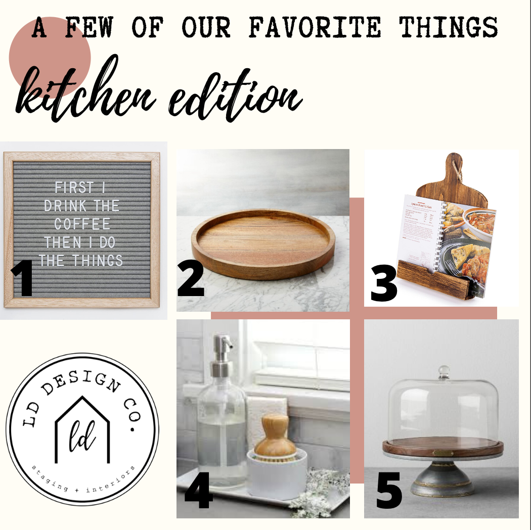
We are often asked what our  favorite go-to staging and decor pieces are.  Well, here are just a few kitchen favorites from our Lead Designer that she says you can’t go without!  Whether you have a birthday wish list, some extra summer spending money, or it’s just time to hit the refresh button, add these beauties to your list.  

Kitchen Items.png


1.  Wooden Message Board Sign

Add some fun and personality to your home by changing up the messages on the board.  Customize the wording for each holiday, what’s for dinner, a quote, or reminders.  The possibilities are endless!

2.  Wood Tray

A wood tray is a great, decorative way to gather a few staple items.  Create a vignette by throwing on salt and pepper grinders, candles, a bowl of lemons, or a kitchen plant. Use the decorated tray as a great centerpiece or in the corner of your countertop.

3.  Cookbook Stand

This go-to, like many others, is stylish and functional, which is a win-win! Display your favorite cook book opened to a comforting family favorite or add a frame with an inspirational quote.

4.  Sink caddy

Who knew soap and scrubbers could look beautiful? It’s enough to make you excited about doing the dishes (maybe). Just remember, keep it neutral and fresh such as light wood bamboo scrubbers and glass decorative soap dispensers. Also, be sure to remove those sponges and kitchen towels for staging. To see more differences between staging and redesign click here
5.  Cake plate

A bright and inviting piece that's both decorative and functional.  Stack with different  fruit for a bold, colorful pop or better yet, load it up with fresh baked, warm chocolate chip cookies.  

Want to freshen up your space and get designer-worthy recommendations? Check this out:

Top 4 Tips For Creating a Vignette

One of our go-to tricks in staging is creating beautiful vignettes, or groupings of items on a flat surface. Vignettes instantly add a designer-worthy style to your home and enhance functionality of your space. All you need are a few loose items, a tray or flat surface, and these 4 tips to get started:

  1. Use functional items to the space

LD Design Co. vacant stage

LD Design Co. vacant stage

In the kitchen, display various kitchen items like bowls, tea cups, or a cute pitcher together on the counter or on a cutting board. On the laundry room counter, add a jar of clothespins with a candle and plant. By adding a functional item, you are suggesting enjoyable and practical use of your space.

2. Vary height of items

LD Design Co. vacant stage

LD Design Co. vacant stage

Be sure to follow the high-medium-low principal when grouping items together. Use books to elevate smaller items.

3. Add an organic touch

LD Design Co. vacant stage

LD Design Co. vacant stage

Add a touch of greenery to give an airy and organic feel to the space. If you don’t have a free standing plant, add stems to a coffee cup, jar, or a functional item to the space.

3. Layer items to create dimension

LD Design Co. vacant stage

LD Design Co. vacant stage

To create depth, place your objects from the back of the flat surface to the front rather than lined up in a straight line. This will add dimension to your vignette.

4. Use odd numbers

LD Design Co. vacant stage

LD Design Co. vacant stage

Group items together in odd numbers. Groups of three or five have a stronger visual impact than a group of two or four.

Happy Staging!

Danielle, Lynley, and Rainie

3 Key Differences Between Staging and Design

Here at LD Design Co. our tagline is:  Staged to Sell, Designed to Dwell, and our team is happy to offer services that cover both ends of the spectrum: staging and design.  So how are they different?  While creativity and an eye for design are essential for both, there are 3 key differences.  

1. To personalize or not, that is the question

In staging we are always trying to de-personalize the space so that it appeals to the largest pool of potential buyers.  That means, removing sports memorabilia, religious symbols, collections, degrees and certificates and family photos. 

In design we want your homes to be personalized to you and your family’s story.   Hang your degrees proudly, showcase that rare porcelain cat collection, add your favorite scripture verse, and let your son decorate his room in his favorite sports teams colors.  

2. Conservative vs Liberal (please, no political jokes)

In staging we keep things conservative, on trend and neutral.  We try to keep all buyers interested, open minded and not overly emotional one way or the other.  

In design you can go bold, use crazy colors, have unique creative furnishings and add complex heavy patterns.  You might be the only person who loves neon paint, but it’s your home and you’re the only person that needs to love it.  

art

3.  Rule Follower or Breaker

In staging we follow rules, lots and lots and lots of rules.   

In design there’s great news for you - there are no rules! If you want a rug on a carpet, put a rug on a carpet. If you want painted ceilings, paint your ceilings. If you block off a walkway so your toddler can’t escape, great!  If you want your formal dining room to be a kids play-room, snap your fingers and make it a playroom. 


Remember- The way you live in your home and the way you stage your home are two different things!  

The 4 Cs of Staging: Communication

We have been unpacking the 4 Cs of Staging over the past month. If you are new here, thanks for joining us, and be sure to check out what you’ve missed here! If you’ve been following along, then you know we are down to the last C….

IMG_1865.JPG

COMMUNICATION

Congrats! You now have all of the important tools and tricks to stage and now just have to put it together effectively to present your property in the best way. Remember, you have the power to determine what your house will communicate to potential buyers. Before the finishing touches, here are 3 important questions to ask when determining what you want to communicate through staging.

1. What do I want my house to say?

You control the narrative of your home. Be sure to complete simple repairs in order to communicate your house is well taken care of. A broken front door knob verses a fixed one can make a difference in communicating your house is attended to. Neutral paint and freshly patched walls communicates your house is worth more versus dropping the price to cover outdated paint and cosmetic repairs.

2. What do I want this room to say?

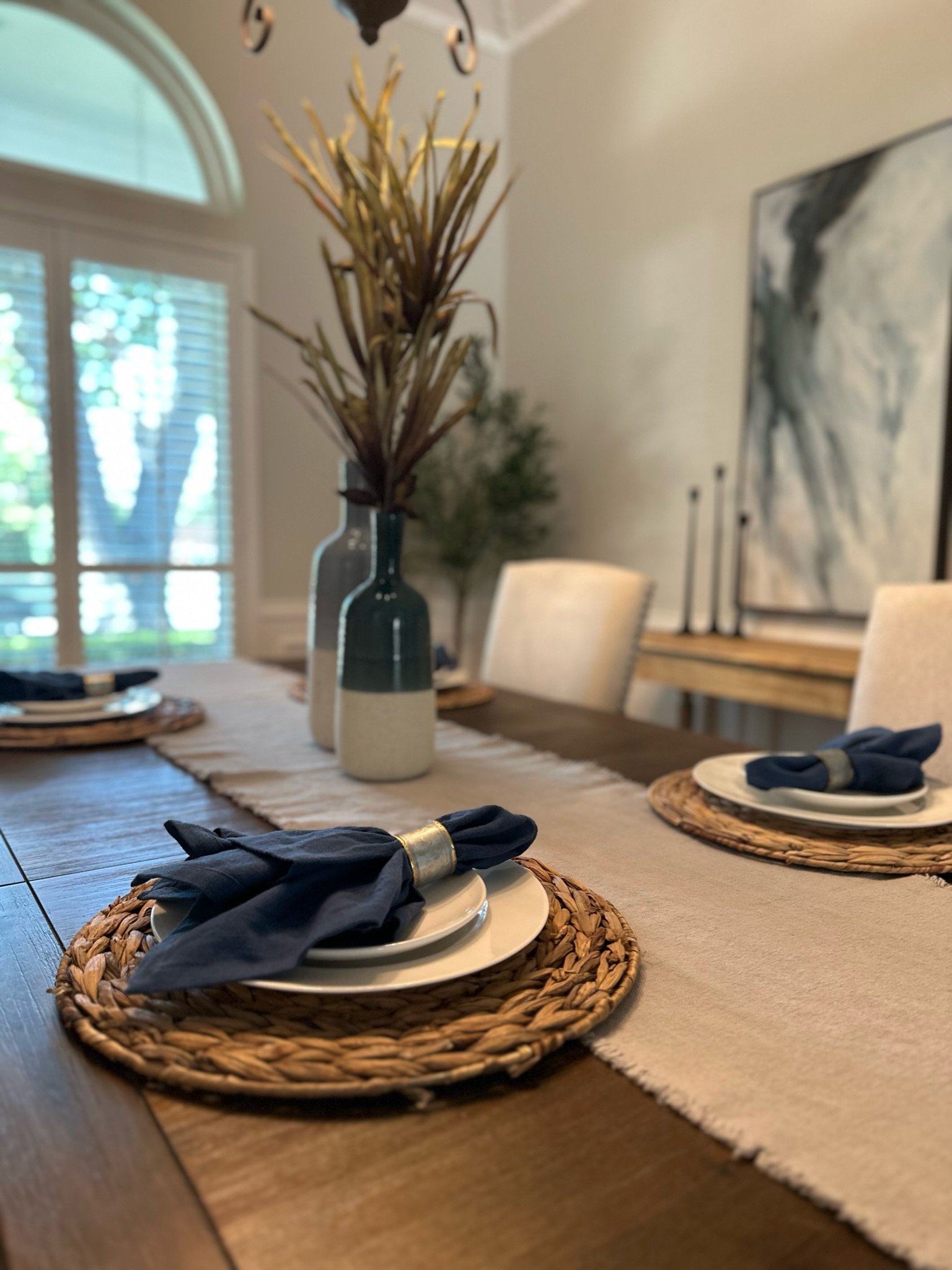
Communicate functional use of each space by adding pops of functionality through trays or decorative items. For example, if you want your dining room to feel like an entertainment space, be sure to set the table with beautiful place settings. If you want to show off your laundry room, add a tray with a jar of powdered detergent, a candle, and clothes pins. Check out more staging ideas and examples here.

3. What do I want my design atheistic to say?

By choosing the right paint colors, textiles, fixtures, and accessories your home can communicate a number of things from a relaxing retreat to a updated family home. You don’t have to break the bank to make this happen. Keep anchor pieces and swap out smaller accessories like throw pillows, rugs, and cabinet hardware to accomplish the vibe you want your home to communicate.


Happy Staging,

Danielle, Lynley, and Rainie